
In this work where people are living in much better conditions and with the help of new technology, it is not surprising to understand that even marketing and sales are not the same anymore. Since new technological time has some innovative demands, we are usually more focused on satisfying them.
However, at times, some good, old-fashioned signs can be more than just a smart move and best bet. A great number of small business finds the materials and graphics worthy and effective when it comes to attracting customers. So, we have prepared a couple of tips on how to catch the attention of your potential customers.
Compelling Color
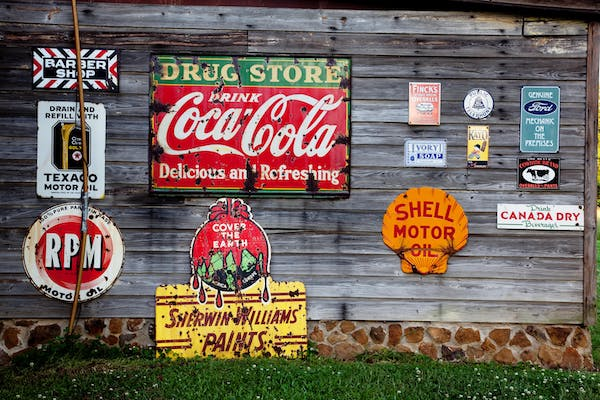
One of the most important factors when it comes to signs is the color pick. Namely, some huge brands use this tool to make their brand’s identity. For instance, today we even have colors with some brand names in them such as Coke red and McDonald’s yellow.
According to some research, there is strong evidence suggesting that even 80% of some brands’ recognition comes from colors. Just as Publik suggests, it is your aim to connect graphics and signs that will help you connect people and places. Your main goal should be attracting people with the tools you have.
Contrast: A Factor Determining Readability
A sign contrast will in the majority of cases determine its readability. To this end, it can be concluded that contrast is one of the biggest features of engaging signs. Speaking of the signs, you can notice that signs are typically determined by the text, graphics in the foreground, and some trendy background colors. So, contrast between these elements is essential for the viewer’s retention of the content displayed.
For instance, you can take into consideration combining a dark color on a very bright background or even the opposite of that. You need to make sure that the contrast is catchy such as black or white or white and blue. When choosing your perfect contrast you need to make sure that you are not pairing similar colors as it can decrease readability.
Take Care of the Size of the Sign, It Matters
To put it simply, the larger the letter the easier it is to read. This one is especially important when you are creating signs that will be displayed at some distance such as the roadside signage. There is rule of the thumb when it comes to the size of letters.
When the signs are displayed at a significant distance, then, using 10 inches per letter will give you the best result and will have the best impact at 100 feet distance. On the other hand, some different typefaces can also be very important for legibility. Even though some flowery elements will create a certain atmosphere and give more information about your brand’s identity, however, it can make a hassle as it will be difficult for people to read the signage from some greater viewing distances.
Nowadays, there are many ways in which you can promote your business and make it stand out from the competition. Creating a good and catchy sign that will represent your brand’s identity is definitely one of the most effective ways. You need to make sure that your sign and brand go hand in hand, otherwise, you will create ambiguity that can cause you problems with some other marketing strategies.


